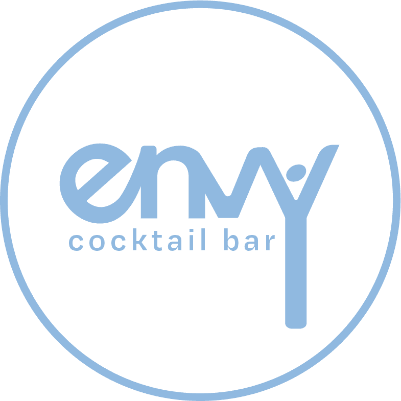
Envy.
Overview
Created as part of an academic project, this brand identity was inspired by my firsthand experience in the hospitality industry.
ENVY is a vibrant cocktail bar concept that celebrates the art of mixology through bold aesthetics and interactive social experiences. Alongside the logo, I developed digital wireframes to illustrate real-world applications. The logo is designed to capture ENVY’s playful, creative spirit while standing out in a competitive market—establishing a strong visual foundation for a brand that values connection, innovation, and memorable experiences.
PROBLEM STATEMENT
How might we design an effective brand strategy that reflects their philosophy?
Design Solution
This logo design targets the audience of the brand by making use of three simple elements.
Simple Typography:
Utilization of clean, modern typography that is easy to read and instantly recognizable. This simplicity ensures versatility across various mediums—menus, signage, social media, and merchandise—while allowing the bright colour palette to take centre stage.


Imagery:
Simple imagery based on items used in the bar stresses the focus of the brand, but also gives the logo a further sense of fun and play. Choosing simple lines and silhouettes of the images allows the brand to maintain its professionalism while emphasizing their focus.
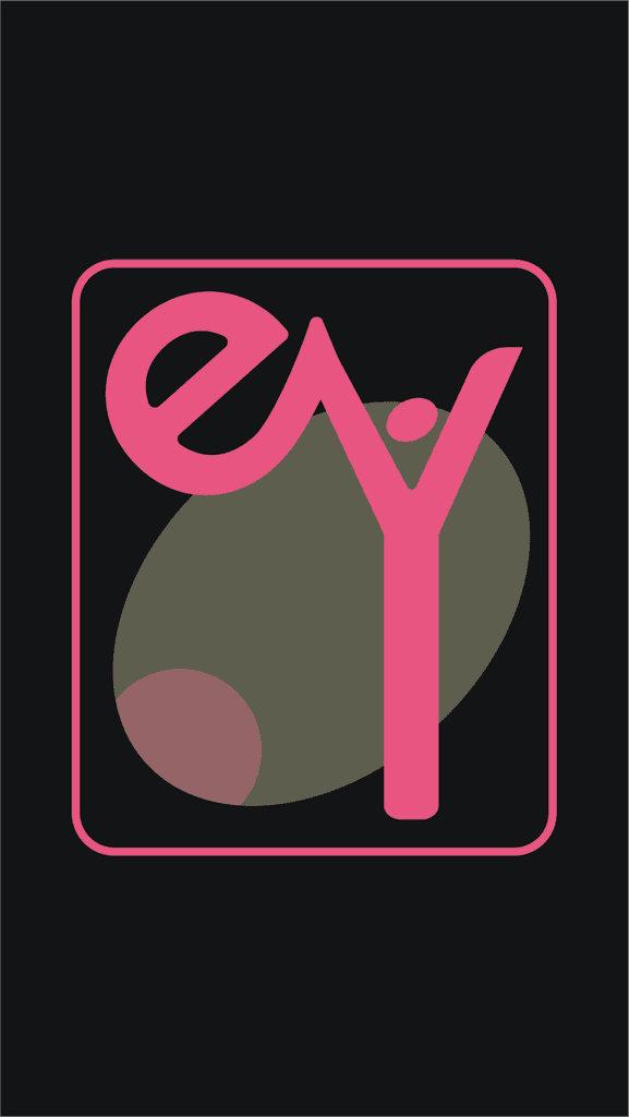
Colour Palette:
A mix of bold, energetic colours (e.g., bright pinks, yellows, and blues) that reflect the playful essence of the bar and create an eye-catching visual identity. In addition to the logo design, I created a further brand strategy page that the company could use as a guide for their future design developments as well as a sample homepage that could demonstrate how the elements would look in a real life setting.


Personas
Surveys
As part of my research, I conducted surveys to gather insights into the preferences, behaviours, and characteristics of potential users. The responses provided valuable real-world data that informed the creation of two realistic personas.
These personas help clarify the target audience for ENVY, allowing me to better understand who I’m designing for. They also serve as a guide for anticipating how different audience segments might perceive the logo, helping me craft a visual identity that fosters recognition and connection. While ENVY does not yet have a defined user base, developing these personas based on survey data establishes a strong foundation for my layouts, interactions, and overall visual approach, ensuring the design is intuitive and user-focused.


Logo Design
When creating the logo, I began with an extensive competitor analysis of other bar logo designs. This allowed me to discover the current trends, common visuals and brand language that other bars use in their logo design.

I organized my key insights into 3 clear themes.


Iteration Sketching
Inspiration
As part of my logo development process, I visited several bars and took photographs to gather visual inspiration.
Capturing details such as interior design, lighting, and glassware helped me understand how atmosphere and visual elements work together to shape a bar's identity. These images served as valuable references, allowing me to explore textures, colours, and styles that could influence the tone and direction of my logo design.

Procreate
Following a thorough visual exploration, I initiated the ideation process by sketching various concepts on my iPad using Procreate.
These sketches encompassed diverse styles, including minimalistic, realistic approaches, as well as an in depth study of the items bars use as initial exploration for potential imagery. The process of ideation was crucial in identifying a range of options for the logo's design.

Exploring different imagery and layouts of the logo in the initial sketches, I transferred the ideas that aligned with the brand philosophy the most into Illustrator to determine which would fit best.
To further refine my logo, I used Illustrator to adjust the type connections, imagery and silhouette of the logo.
To further refine my logo, I used Illustrator to adjust the type connections, imagery and silhouette of the logo.


Color Palette
After finalising my logo, I decided on a vibrant and bold colour palette that reflects the brand's philosophy.
This palette was thoughtfully developed by exploring which colours would resonate both visually and conceptually with a brand like Envy. The integration of bright colours in a cocktail bar not only enhances visual appeal, but also encourages an energetic atmosphere that attracts customers and encourages social interaction.
These vibrant hues establish a memorable brand identity, evoke positive emotions, and inspire creativity, making the space more inviting. This dynamic colour scheme aims to elevate the aesthetic of the logo and enrich overall guest experiences, positioning the bar as a standout destination.
